
Client
Heybor
Sector
Housing Industry
My Role
Lead UX/UI Designer
Team Members
Tyler Benjamin (Product Manager) and Mike K. (Engineer)
Project Timeline
2019 - 2020 (14 months)
About
Heybor is a startup getting ready for a huge relaunch. Their goal is to equip users with all of the information they need about apartment buildings in NYC. My role at this startup was the lead UX/UI designer. I designed the landing website and the app that will be released at the end of August 2020. This page will contain my process of creating the iOS application.
The Story

The Challenge

The Solution


The Intro
My Role
Acted as the Lead UX/UI designer, documentation specialist, responsible for conducting interviews, research analysis, prototyping, usability testing, and visual design.
Tools Used
Adobe xD, Invision, Miro, Slack and Trello
Objective
-
Create a sleek easy to use interface
-
Provide employees an easy way to complete a task on the backend enterprise software (case study coming soon)
-
Create a promotion landing page website (see case study here)
Initial Assumption
-
Users are tech-savvy
-
Users have a routine for leaving a review
-
Users want an easier way to gain knowledge of apartments
-
Users have a routine for uploading pictures from a camera roll
Research
User Interviews
-
What did the user interviews consist of:
-
Interview 30 people who live in an apartment building in New York City
-
-
Participants
-
The age range of the participants was between 20 to mid-'40s
-
All participants reside in one of the 5 boroughs
-
-
Communication
-
All questions were asked in person. I led the interviews while Tyler took notes
-
-
What needed to be understood after the interview
-
What needs need to be met when a user is looking for an apartment in NYC?
-
Would users benefit from direct communication with other residents of a building?
-
What needs are present in a user who already resides in a building?
-
Here is a link to a few of the responses from the interviews: Click Here


Affinity Map
After gathering all of the findings from our interviews, the next step was to conduct an affinity map. We needed to find insights, and build connections between the user needs and the goals of the application.
Users

Questions that need to be answered
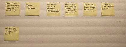
Application Features

Building Features

Competitive Analysis

Findings
-
All companies provide general information about a building (year built, amount of apartments, amenities)
-
Few sites have reviews listed
Comparative Analysis

Findings
-
Users had to know what apartment they wanted learn about and then search up the reviews on their site
-
There is a potential for review filtering
-
Average reviews left: 12
-
The review process starts with the user coming across the property on a different platform
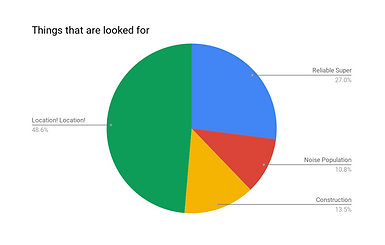
Insights
Key Insights
-
Users are more concerned with geographical information about a building
-
Numerous modes of residential communication makes it difficult for people
-
People have a hard time getting acclimated to new surroundings.
-
Key to success: information available
-
Since NY has a competitive housing market, many people have to apply for places right after they see it without doing extensive research
Key Parameters
-
Amount of residential buildings uploaded
-
Amount of users signed up
-
Amount of reviews left on a residential building
-
Amount of users subscribed to a residential building

Persona


Ideation
User Flow


Paper Prototype


After showing the paper sketches to the stakeholders, I was told that this version would be too much for the MVP. So I went back and toned it down. I removed things that got in the way of the user coming on the app and interacting with reviews. I took out the ability to see things like bars, parks, and restaurants that are nearby. I rethought about the menubar and what is essential to the user during the MVP while also hitting the goals given to me by the stakeholders. And I removed the map and left the search bar. But I needed to fill the homepage with some sort of engaging tool. So I thought about Olivia, (first persona) she is new to NY, how can I provide help if needed? On the engineering side, it needs to be something that can be easily developed, and wouldn't extend the timeline of the project! An informational guide!
High Fidelity Sketches


Issue #1 Reviews
When I first designed the building page the reviews were placed at the bottom of the page. The reason being was that reviews are always placed at the bottom of the page, this was industry standard, this is what people are used to. But after talking with the PM, and receiving feedback, we decided to conduct A/B testing with two versions (one with the reviews at the top of the page, one with the reviews at the bottom of the page)
Version A

Version B

After testing 20 people, we found that users favored Version A. Being favored by both users and the business team, for users being able to accomplish the task of the MVP, we went with version A. This also gave me the opportunity to develop my information architecture skill.
Issue #2 Collaboration
This was my first time working with an offshore engineering team that came on board after the iteration process was completed. Which presented itself to be a huge challenge. Because they were not aware of why certain features were designed in the way they were, what they had coded did not match my designs 100%. At first I vocal expressed the feedback, but that did not make a huge difference, so I had to think outside the box. I created a feedback document that I presented to the team every week that listed changes that needed to be made.

Walkthrough

Validation
Bill Scott Review


User Testing
Goal
-
How efficiently can a user complete their required task?
Usability Test
-
A remote testing session was conducted over zoom with Adobe xd and Invision
User Testing Scorecard
- Issues found by users categorized in order of severity by using the "Jakob Nielsen Severity Scale":
- Level 0: I don't agree that this is a usability problem
- Level 1: Cosmetic problem only: need not be fixed unless extra time is available on project
-
Level 2: Minor usability problem: fixing this should be given low priority
-
Level 3: Major usability problem: important to fix, so should be given high priority
-
Level 4: Usability catastrophe: imperative to fix this before product can be released


Testing Card
Testers: Tyler Benjamin & Tiffany Billey
Device: User’s Phones
Users: 10
Date: July 19th - July 26th
Time: 10am - 7pm
Location: Zoom
Hypothesis
We believe that:
-
Users will easily understand how to navigate the core functions of the app. Users will be able to add a building and write a review.
Metric
-
And measure: feedback and reaction of the participants
Criteria
-
We are right if: Users can successfully add a building and write a review.
Learning Card
-
We believed that: Users will easily understand how to navigate the core functions of the app. Users will be able to add a building and write a review.
We observed that:
-
10/10 (100%) users download the beta app
-
10/10 (100%) users created an account
-
10/10 (100%) users searched for their building
-
10/10 (100%) added their building
-
0/10 (0%) added their building name
-
9/10 (5.26%) added their building photo (the function became optional towards the end of the testing period)
-
3/10 (30%) added their building description
-
1/10 (10%) added their building year
-
10/10 (100%) users added their building features
-
10/10 (100%) user wrote a review about their building
-
10/10 (100%) users confirmed their building
-
10/10 (100%) users searched for appointed building in Brooklyn
-
10/10 (100%) users vocally state at least 3 features on the building page
-
9/10 (90%) users left a review on the building page
-
8/10 (90%) users identified a review using tags
-
10/10 (100%) users thumbs up a review
-
10/10 (100%) users wrote a question
-
10/10 (100%) users replied to a question
-
10/10 (100%) user located the nearest transportation system
Trivial :
-
Users on an iPhone
-
3/10 (30%) of users were on an iPhone 11
-
4/10 (40%) of users were on an iPhone X
-
1/10 (10%) of users were on an iPhone 11 Pro Max
-
1/10 (10%) of users were on an iPhone 8c
-
1/10 (10%) of users were on an iPhone Xr
-
-
Favorite applications
-
4/10 (40%) Instagram
-
3/10 (30%) Twitter
-
1/10 (10%) Facebook Messenger
-
1/10 (10%) Google Drive
-
1/10 (10%) Pinterest
-
Success rate:
-
Users created an account - 10/10 (100%)
-
1/10 (10%) of users used a social media sign-in. 9/10 (90%) added a picture. 8/10 (80%) of users signed up without being asked.
-
-
Users added their building- 10/10 (100%)
-
All users managed to add their building to the app. Most found it tedious because they did not know a lot of the answers. 1/10 (10%) of users left the application to research their building and came back to the app to fill out all of the sections. This user copied and pasted the description from StreetEasy into the Heybor description tab. 9/10 (90%) of users were stuck when asked for a building name. 9/10 (90%) of users described this process as “simple” and “intuitive”
-
-
Users were able to write a review on their building -10/10 (100%)
-
1/10 of users thought it was odd that the sentence they were typing out did not wrap in the review box. They described this as negative affect. 2/10(20%) of users were unsure about what a tag was. However, 1/2 (50%) of those 2 users were able to understand the concept when asked: “how many reviews were about management.”
-
-
Users added a review to the appointed building- 9/10 (90%)
-
1/10(10%) of users were unable to add a review because they were confused about the x button that replaces the pencil. 10/10 (100%) of users were able to thumbs up/down a review. However, 1/10 (10%) of users were confused, because their review was thumbs down as soon as it was posted.
-
We asked the users at the end of the test the following question:
-
How would you describe your overall experience?
-
Many users described their experience as “good,” “straightforward,” and/or “intuitive.” The one feature that was a hit among the masses was the tags. 1 user said they liked it after they figured out what it did. Another user suggested that it should be applied to the “Got a question” section, so they can know what questions are there to avoid posting a duplicate. The copy being misspelled or noncoherent came up a lot when asked about their experience and so did the icons. 5/10 (50%) of users were unclear on what it meant to claim a building. They thought it was the same thing as subscribing to a building.
-
-
Therefore, we will:
-
Have another copy session, where all of the copy gets looked over and change what does not make sense
-
Make it apparent what fields on the add a building page is optional
-
Add a notification that tells users they successfully added a building
-
Remove or modify “Claim this building”
-
-
Overall Comments:
-
Last week’s test focused on making sure that MVP was in working shape for the release on August 3rd. It needed to be confirmed that users can complete the core task without any problems and/or bugs. The first half of this test was a bit different because a few features were changed, (making the photo optional) But with the change, it did not skew the results. Users were still able to create an account, add a building, and write a review. Once the small things are looked after, the app will be in a good shape for its release.
-
Key Takeaway
-
Users wished they saw a map for transit details
-
“Claim this building” was confusing
-
All of the fields that was asked in “Add a Building” was not common knowledge
-
Unsure about the subscribe button
-
The X button was missing in a few screens
Final Design
Style Guide

Final Design Changes


App Store Reviews


Final
Takeaway
What I learned
-
With working closely with the product manager, and the engineer having a transparent and open dialogue during all phases were extremely crucial to the development of the app.
-
Gathering user data from research like interviews and testing helped us shape the features of the app that not only delivered on the core business needs but also got users excited to use the app.
What's next for Heybor:
Research:
-
Diving deeper into competitors and the insights of building owners/managers
Secondary Flow:
-
Adding another user/ persona, the building managers
Design
-
Adding another section to the site that allows managers and residents to communicate
-
Due to business needs, adding a way to incorporate ads to be displayed